
Meta Ad Size Guide 2026: Specs by Placement
Current meta ad size specs for Facebook and Instagram in 2026: image and video dimensions, aspect ratios, file limits and safe zones by placement.
A Meta ad can fit the upload requirements and still lose its headline in the placement. Meta’s image placement guidance distinguishes Feed compositions from full-screen creative and warns that interface elements can obscure important content. Technical acceptance isn’t the same as a usable ad.
The right Meta ad size starts with the placement, not the export preset. Build around the visible area, preserve the product and offer, and create a separate composition when a crop can’t do both.
Table of Contents
- Meta Ad Sizes at a Glance
- How Placements Group by Ratio
- Image Rules for Feed and Carousel Ads
- Video Specs by Placement
- Safe Zones for Full-Screen Placements
- One Creative Across Several Placements
- Common Creative Problems and How to Fix Them
- Check Specs Before Your Next Upload
Meta Ad Sizes at a Glance
Choose the ratio by placement first. Then check recommended pixels, minimum dimensions, and the file limit for the actual media format.
Use this March 2026 production reference as a placement lookup. Entries marked “Check placement specification” need confirmation in Meta’s selected-placement documentation before export. They aren’t permission to carry a Feed image limit into a video placement.
Meta ad sizes by placement
| Placement | Aspect ratio | Recommended pixels | Minimum | Max file size |
|---|---|---|---|---|
| Feed, square | 1:1 | 1080 × 1080; production standard 1440 × 1440 | 600 px width | 30 MB for images |
| Feed, portrait | 4:5 | 1440 × 1800 | 600 px width | 30 MB for images |
| Carousel cards | 1:1 | Check carousel placement specification | Check carousel placement specification | Check image or video card specification |
| Stories | 9:16 | 1080 × 1920 | 500 × 888 for the cited vertical format | Check selected media specification |
| Status | 9:16 | 1080 × 1920 | Check Status specification | Check selected media specification |
| Reels | 9:16 | 1080 × 1920 | Check Reels specification | Check selected media specification |
| In-stream video | 16:9 | Check in-stream video specification | Check in-stream video specification | Check in-stream video specification |
| Audience Network | 9:16 | Check selected Audience Network format | Check selected Audience Network format | Check selected media specification |
Recommended size and minimum size answer different questions. The recommendation gives the designer a sensible production target. The minimum describes an acceptance boundary, not a promise of sharp text or detailed packaging.
For Feed images, use JPG or PNG. Keep the export within the image file limit and close to the target ratio. Don’t assume that a file which looks square in a folder thumbnail has the correct dimensions.
Read the table as an export decision
- Placement first. Select the row that matches where the ad will appear, not just whether it runs on Facebook or Instagram.
- Media second. Image limits don’t establish video limits. A carousel can also require checks at the individual card level.
- Quality third. Start with the high-resolution original. Enlarging a small download doesn’t restore missing detail.
- Preview last. Confirm the visible crop after assigning the asset to its placement.
Some guides cite a larger vertical production canvas. That’s an export choice, not a separate official Reels placement category. More pixels won’t fix a headline positioned behind a button.
Production rule: Save the placement and media type beside every export preset. “Social vertical” is too vague to approve for launch.
How Placements Group by Ratio
Group placements into Feed, full-screen vertical, and horizontal video families. Share source artwork within a family, but don’t assume every placement can share the final composition.
For this March 2026 reference, Meta’s placement ratio guidance recommends 9:16 for Stories, Status, Reels, and Audience Network, while in-stream video uses 16:9. Its cited vertical carousel specification lists 1080 × 1920 pixels, with 500 × 888 pixels as the minimum for that format.
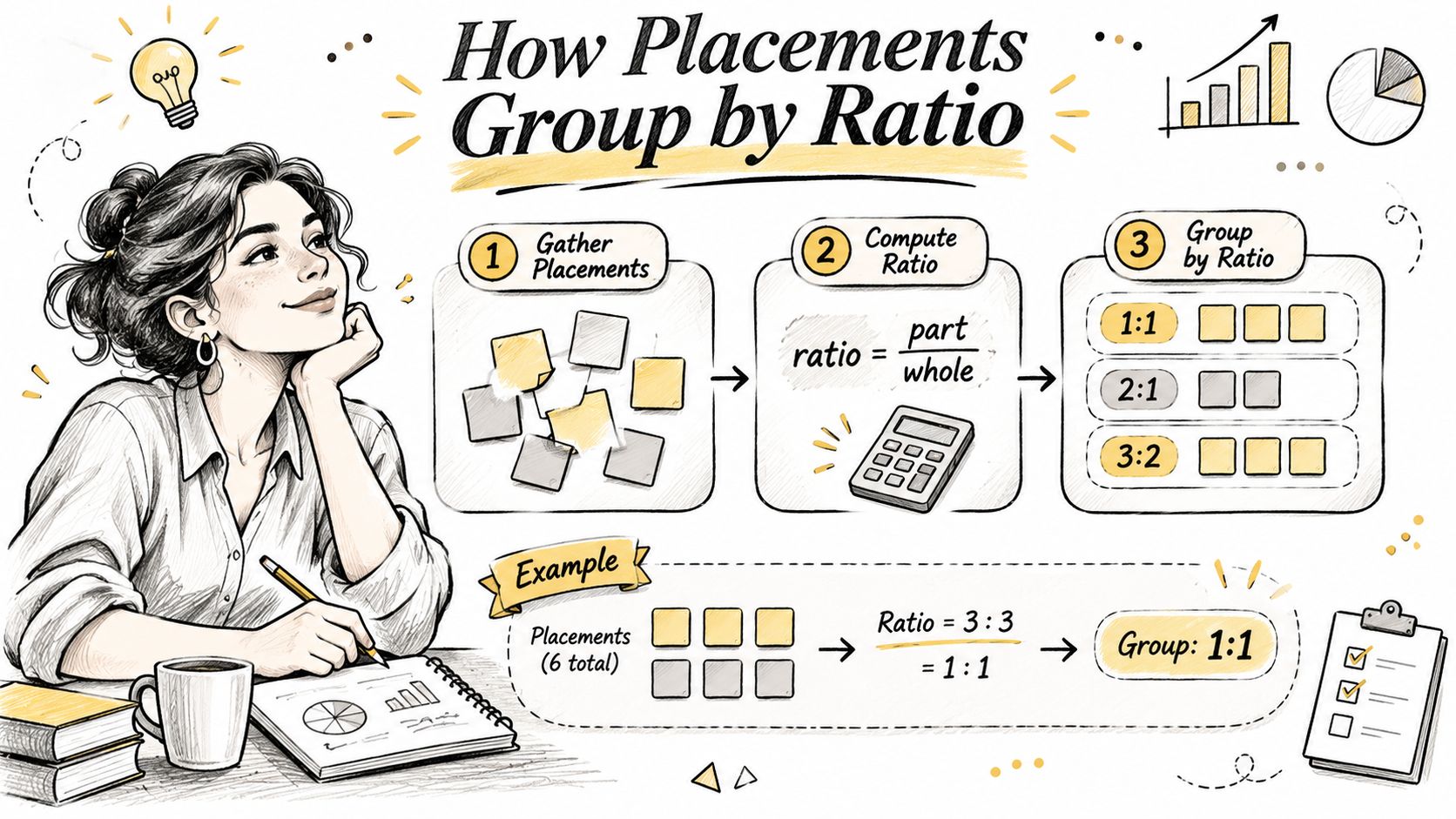
Match the composition to the viewing surface
Feed accepts square and portrait compositions for images and video. A taller Feed composition gives the designer more vertical room than a square, but that room should improve the product presentation, not encourage extra copy.
Stories, Status, and Reels belong to the full-screen vertical family. Their orientation follows how people generally hold a phone. A vertical composition lets the designer arrange the product, headline, and supporting action along the screen instead of squeezing them into a horizontal strip.
In-stream video belongs to a different viewing context. Preserve a horizontal composition when the scene needs width. If the same footage must run in Stories, reframe the action rather than shrinking the entire wide edit into the middle.
Keep square carousel cards consistent as a set. Audience Network belongs in the vertical planning family under the cited recommendation, but its selected format still needs its own acceptance check.
Assign masters before designing derivatives
- List every selected placement. Work from the actual campaign setup. Don’t export for placements the campaign won’t use.
- Assign a master to each family. A product campaign using Feed and Stories needs a Feed composition and a full-screen composition.
- Flag exceptions before production. A close-up demonstration may crop cleanly. A wide product lineup may need a new layout.
A master is an editable composition, not merely a flattened file. Keep the product, headline, logo, and background on separate layers. That makes repositioning possible without rebuilding the ad.
Image Rules for Feed and Carousel Ads
For Feed images, use JPG or PNG and check width, file size, and ratio before upload. For carousel images, preserve the same ratio across the card set.
For this March 2026 reference, Meta’s Feed resolution guidance supports 1:1 and 4:5 for Feed images and videos, with recommended Feed image sizes of 1080 × 1080 pixels for square and 1440 × 1800 pixels for portrait.
The Feed image specification also establishes a minimum width, an image file ceiling, and an aspect-ratio tolerance. Apply those acceptance checks separately from the recommended resolution. Passing the minimum doesn’t mean the image is ready to approve.
Choose the right Feed composition
Facebook Feed favors a portrait composition. Instagram Feed’s square recommendation makes a useful starting point when the product and headline fit comfortably together. Neither choice removes the need to inspect the finished placement preview.
Keep a larger square production master when it helps your design workflow. It gives the team a consistent source for derivatives without treating every derivative as the same deliverable.
Consider these hypothetical Feed exports:
- Recommended portrait export. A Feed image exported at the recommended portrait dimensions preserves both the intended ratio and the production target.
- Smaller portrait export. A Feed file can retain the correct portrait ratio while falling below the recommended pixel dimensions. It may upload, but it deserves a closer sharpness check.
- Near-minimum square export. A small square Feed file may clear the width requirement while leaving packaging labels or fine text visibly weak.
Don’t enlarge a small source to make its properties panel display a larger number. Return to the original photography or artwork.
Build carousel cards as a set
Use shared guides for the product position, headline baseline, and logo. Check each card alone, then review the sequence. Consistent dimensions won’t prevent a carousel from feeling uneven if the product changes scale dramatically between cards.
Generate placement crops deliberately in Photoshop, Figma, or your design tool. Automatic cropping can remove the product edge or separate a headline from the object it describes.
Before upload, check:
- Format. Confirm the actual export is JPG or PNG, not just a renamed file.
- File size. Inspect the exported file, not the editable document.
- Ratio. Read the pixel dimensions and compare them with the intended placement.
A correct file extension won’t rescue a poor crop. Approve the composition and the technical properties separately.
Video Specs by Placement
Video ratio follows the placement. Keep separate Feed and full-screen masters, then add a horizontal cut when the campaign includes in-stream video.
For March 2026 production, Meta’s placement and upload guidance identifies 1:1 or 4:5 for Feed, 9:16 for Stories, Status, and Reels, and 16:9 for in-stream video; its upload guidance specifies a 600 px minimum width. Confirm the selected video placement’s duration and maximum file size before encoding.
The Feed image ceiling isn’t a video ceiling. Don’t copy an image preset’s file limit into the video export sheet. Record the video duration and file-size requirements only after checking the actual video specification.
Export from the source, not another compressed derivative
- Build the full-screen master. Reframe Stories, Status, and Reels around the subject. Keep essential action away from interface areas.
- Create the Feed version. Adjust the product scale and caption placement for the shorter frame. Don’t assume a center crop preserves the demonstration.
- Keep in-stream separate. Preserve useful horizontal context, especially when the action moves across the scene.
- Re-cut horizontal openings. If the subject becomes tiny in a full-screen export, change the framing or edit. Black bars don’t solve the composition problem.
- Check text through motion. Captions can be clear on the opening frame and collide with the product later.
Play the beginning of each exported file at phone size. Check the hook, product visibility, captions, and final call to action. Then inspect the placement preview with the actual ad copy attached.
Use these video examples to assess framing and editing choices:
Make repeat exports repeatable
When the edit is approved and the remaining work is producing derivatives, the RenderIO guide to automate Instagram exports with RenderIO is a useful workflow resource. Keep composition approval ahead of export automation.
For creative planning, review Facebook video ad examples for ways to organize a demonstration or offer. Borrow the communication approach, not an unchecked export preset.
Safe Zones for Full-Screen Placements
Keep essential text, logos, and product details inside the central area of full-screen creative. A full-height file doesn’t give you a full-height unobstructed advertising surface.
For March 2026 planning, Primores’ industry safe-zone guidance recommends keeping essential content out of roughly the top 14%, bottom 20–35%, and 6% on each side of Stories and Reels creative. These are industry working margins, not an official Meta measurement.
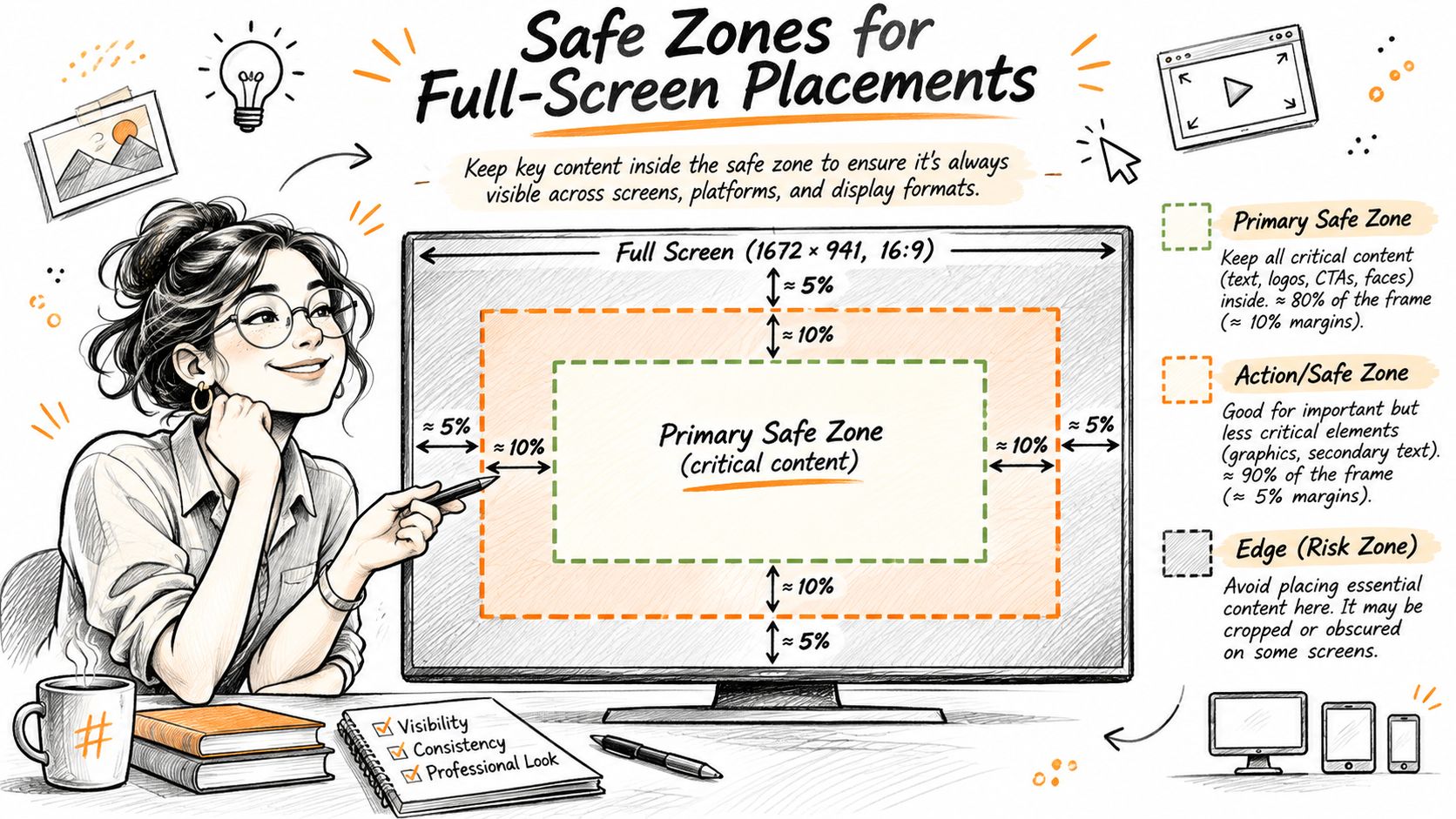
Design for the interface over the artwork
The profile area, captions, engagement controls, and call-to-action button can sit over the creative. Their positions matter more than whether your designer can see every element in the source file.
A headline placed close to the top can collide with the profile area. Move it toward the center and check whether it still has enough separation from the product. A logo in the bottom-right corner needs the same treatment: move it up and inward rather than reducing it until it becomes unreadable.
Background color, texture, and nonessential scenery can extend into the outer areas. The product claim, price, disclaimer, and brand identifier shouldn’t depend on those edges remaining visible.
For additional production context, Nim’s guide to 9:16 vertical specs for Reels can help organize the vertical export. Use the live placement preview to make the final visibility decision.
Apply an overlay before approval
- Add a safe-zone overlay. Put it on a locked guide layer in Figma or Photoshop so the team can toggle it without moving it.
- Reposition essential content. Move headlines, prices, logos, and meaningful product details inside the working area.
- Preview Stories and Reels separately. Attach the intended copy and inspect the interface around the creative.
- Check the Feed derivative independently. Confirm that its crop still shows the product and supporting information.
For video, scrub through the entire edit with the guide visible. A moving product or animated caption can cross into an obstructed area after the opening frame.
Approval test: If the offer becomes unclear when the outer areas are covered, change the composition before export.
One Creative Across Several Placements
A full-screen master can serve Stories, Status, and Reels when the message survives each preview. A Feed-first design shouldn’t be forced into that family just to reduce the export count.
The efficiency question isn’t how many files the designer produced. It’s whether each delivered ad communicates the offer without repairs, hidden text, or misleading test results.
Use a composition decision rule
Ask these questions before adapting the master:
- Does the message depend on small text? Rebuild the hierarchy so the essential claim remains readable.
- Does the entire product pack shot matter? Create a separate arrangement if cropping removes the label, accessory, or identifying feature.
- Does the ad include a disclaimer or edge-to-edge branding? Give that content a placement-specific position rather than hoping the crop preserves it.
If any answer is yes, build a separate composition for the affected placement. Share the photography, offer, and visual identity, not necessarily the layout.
An AI video workflow such as the ShortGenius Meta ad creator belongs upstream of that approval decision. Generated creative still needs a placement assignment, a crop review, and an identifiable export version.
Test the adaptation, not a different offer
For a March 2026 testing framework, Hubstudio’s creative specification guide recommends comparing 4:5 Feed and 9:16 full-screen versions with identical offers, then reviewing CTR, CPC, conversion rate, and ROAS by placement. Treat this as a test design, not evidence that either ratio guarantees better performance.
Keep the audience, destination, and offer as comparable as the campaign setup allows. Don’t declare a ratio the winner when the stronger version also has a different price or headline.
Record the file version, assigned placement, and ad identifier. Inspect delivered crops where available, not just the original upload preview. For broader campaign planning, use a paid social media ads workflow that connects creative decisions to the intended conversion.
Write the composition decision rule into the creative brief template. Run a placement test before rolling the same adaptation across accounts.
Common Creative Problems and How to Fix Them
Start an upload rejection with the file properties and the exact error message. Start a weak-looking ad with the crop, text visibility, and source quality.
A technical rejection usually calls for an export correction. A misleading crop calls for a composition correction. Don’t spend time redesigning the ad when the error is an invalid file property.
Creative problems, causes and fixes
Use this March 2026 troubleshooting lookup alongside the selected placement’s requirements.
| Symptom | Likely cause | Fix |
|---|---|---|
| Feed image upload rejected for size | Feed image exceeds its image file ceiling | Export a smaller JPG or PNG within the Feed image limit |
| Video rejected for size or length | Export exceeds the selected video placement’s requirements | Recheck Meta’s current video specification, then re-encode from the high-resolution master |
| Feed image rejected for width | Feed image falls below the required width | Export again from the high-resolution source |
| Feed ad cropped badly | Automatic crop removed the product or headline | Generate the square or portrait Feed crop by hand |
| Text hidden on Stories | Text sits in an interface-covered area | Move text inside the central safe area |
| Feed image looks blurry or blocky | Heavy compression or inadequate source detail | Export at the recommended Feed resolution with less compression |
| Carousel cards change size | Mixed ratios across the card set | Apply the same ratio to every card |
| Vertical video shows black bars | Landscape edit was letterboxed | Create a separate full-screen vertical cut |
Fix the export without damaging the artwork
Regenerate crops instead of stretching them. Stretching changes the product’s proportions and can make packaging look wrong. Reposition the source layers inside the intended frame.
Return to the original for blur. Repeatedly saving a compressed image adds another weak derivative to the workflow. If the original is already soft, replace it rather than sharpening text until it develops visible halos.
Read the rejection before changing settings. File size, dimensions, duration, and format are separate properties. Change the property named in the error, then validate the full export again.
Inspect moving captions through the edit. A caption can overlap an engagement control only during part of the video. A still-frame review won’t catch that.
Review the delivered appearance. A nominally correct ratio doesn’t prove that the product, claim, and action remain legible together. Keep a record of any crop adjustment applied in the ad setup.
For performance problems that remain after the technical checks, use a broader Facebook ads optimization process. A valid export can still have an unclear offer, weak destination, or unsuitable creative concept.
Check Specs Before Your Next Upload
Verify the placement, export, visible content, and current documentation before launch. Keep creative approval separate from the decision to start spending.
Use this final checklist for March 2026 production. Record the documentation check date in the creative handoff so the next person knows whether the preset needs review.
The launch checklist
- List the placements. Confirm the actual campaign selection and remove unused exports from the handoff folder.
- Match ratio and pixels. Check each file against its named placement. Don’t approve a generic square, portrait, or vertical preset without the placement label.
- Inspect image properties. Verify JPG or PNG, minimum width, ratio tolerance, and the applicable image file ceiling.
- Review full-screen visibility. Toggle the safe-zone overlay, then inspect Stories and Reels with their interface previews.
- Check carousel consistency. Keep the same ratio across cards and review the complete sequence.
- Recheck official specifications. Confirm the selected image or video requirements before the files go live, especially video duration and file-size limits.
Keep the approved source, export, and placement assignment together. That makes a later correction a controlled revision rather than another round of guessing which file ran.
Keep account actions accountable
AdCrunch connects Claude, ChatGPT, and the Adgent to ad operations. The agent can upload images and videos to a Meta or TikTok ad account’s library. On Meta, it also changes budgets, bids, and schedules, and builds campaigns, ad sets, creatives, and ads.
Its guardrails include no hard-deletes and no targeting change on an existing ad set. Everything it builds or copies arrives paused. New Meta builds spend only after a separate request to resume them, and a person confirms each change that starts spend or raises a budget.
Every change appears on the Activity page with the ad account, what changed, who asked for it, and whether it worked. AdCrunch supports agencies and in-house teams that need that account-level record.
As of March 2026, Pro costs $99 a month, flat, plus tax, with a 7-day trial and nothing charged for 7 days. A card is required at checkout.
AdCrunch lets you move from approved creative files to Meta account actions through an AI client, with paused builds and a permanent Activity record. Visit AdCrunch to connect your accounts and use that controlled workflow for your next placement-ready campaign.